2025 Label Contest Winners
This year marks WineMaker’s 25th annual Label Contest for amateur winemakers, and the results did not disappoint! We sorted through entries from home wineries across the world as we selected our favorite labels. Clearly, making wine isn’t the only creative outlet our readers have, as choosing from the hundreds of entries submitted was even more difficult than usual this year. We just hope the wine inside these bottles is of similar quality!
From a faceless woman and a woman’s face seemingly appearing in fermenting must, to a design for a Scottish fiddler and an interior designer’s inside joke that his friends still don’t recognize with bottles he gifts each year, our favorite labels include original artwork and new takes on classic ideas. Arguments can (and were) made for a number of the labels that just missed the top four to be awarded a medal, and even more labels that did not make the cut for honorable mention most years could have snuck onto these pages. We had to stick to our convictions and vote for our favorites. At the end of the day, we’re pretty excited about the results.
We hope readers enjoy viewing our selections as much as we enjoyed choosing them. And join us in thanking the sponsors who donated such great prizes to the winners again this year.
Grand
Santiago Zegada • Tampa, Florida
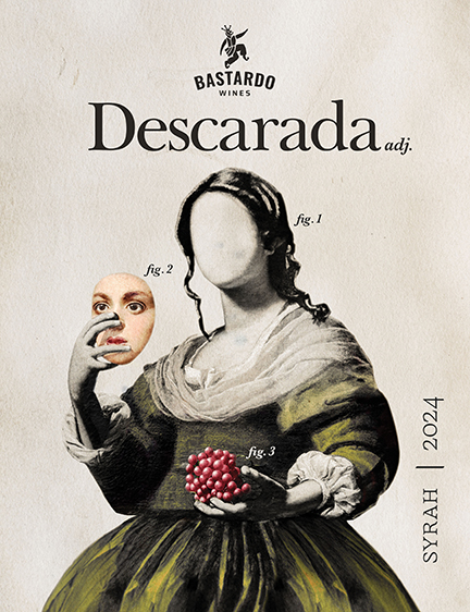
Created by Santiago’s girlfriend Camila Rojas’ design studio (Keemis Studio), Descarada is made from Syrah grapes from the valley of Tarija, Bolivia. Santiago explains the wine’s name: “First, the English translation of descarada is ‘shameless, insolent, impertinent,’ but its literal origin is ‘des-carada,’ which means faceless. So, our label plays with this double meaning showing a woman without a face. Second, it invites us to reflect on the term descarada, which is generally used in a pejorative way to refer to a woman who breaks the rules of a sexist and judging society. On our back label we redefine the term descarada as: “A woman who behaves or speaks in an empowered, bold, and self-assured manner, unconcerned about others’ opinions regarding her way of thinking or acting.”
Gold
Zoë Trebil • Excelsior, Minnesota
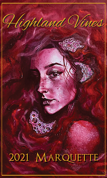
Zoë makes all of the labels for her dad’s wines using her original art. This oil painting of her best friend carries a deep and personal meaning. “The rich, flowing red wine enveloping her represents both passion and vulnerability — how we can become consumed by our thoughts and feelings, both the beautiful and the painful,” she said. “I wanted to capture the essence of being fully immersed in the highs and lows of life, embracing them rather than shying away, and finding beauty even in the most intense, transformative moments.”
Silver
Robert Outenreath • San Rafael, California
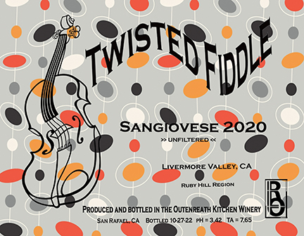
This label combines two of Rob’s passions — wine and violins. “I make and play violins so when I started making wine and thinking about a label ‘brand’ for myself, I wanted my labels to have something to do with violins. Although I primarily play classical music, I also play Scottish fiddle music and somewhere along the way the name Twisted Fiddle just popped into my mind. I find that making violins and wine involve the exact same mental process and creativity.”
Bronze
Travis Wilson • Falls of Rough, Kentucky
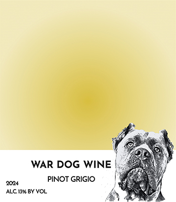
Judges loved the simple approach to this label designed like a Pantone color square with his wife’s service dog Malachi. “I’m an architect and interior designer and played with the Pantone template . . . I just used the basic form and Photoshopped everything for my needs. My colleagues are always excited to see which Malachi expression they will receive for Christmas.” What Travis didn’t mention until we e-mailed him, is we were the first to recognize the label as a play on the Pantone design.
Honorable Mentions
