2016 Label Contest Winners
Sure, a bottle of wine doesn’t necessarily NEED a fancy label to say what’s inside. Through the years we at WineMaker have seen all kinds of different ways to label a bottle of homemade wine — from duct tape to rubber bands to string. Of course it’s more fun to come up with a special label for your own wine, which is why we started our annual label contest! Each year home winemakers send in piles of their favorite homemade labels for us to judge, and each year we carefully pore over the entries to find our most favorite. This year we were impressed with a family crest, fell for a fun fruit wine design, scouted out a Pinot Noir with a park ranger feel, and indulged our long-time love for watercolor painting. Also, new this year, we let readers choose a favorite, too! Check out the first annual “Reader’s Choice” winner on page 58. Thank you to all of the home label artists out there who entered the competition this year, and also a big thank you to all of our sponsors for the many great prizes!
GRAND
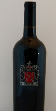
When Rui wanted to create a label for his homemade wine, he wanted it to reflect his family’s tradition of home winemaking. “We have been amateur ‘garagistes’ making home wine on three continents for over 200 years,” he said, “and the family coat of arms had to show tradition, pride, and quality in craftsmanship.” The family coat of arms label for Rui’s red wine is actually made of metal and then glued to the bottle, creating a very regal bottle, indeed. “Our wine is a friendship offering that passes along our love affair for people, food, and wine.”
GOLD

The fresh-looking design for Heather’s fruit wine label was created to reflect the fruit that she found growing on her property. “Last year we discovered fruit on a couple of trees in our yard. After hours of Googling, we learned that this fruit is Pineapple Guava, also known as Feijoa. The flowers and fruit have a tropical smell and taste, so we decided to make wine.” The artwork is hand-drawn, and Heather said that she designed the art to look like vintage fruit crate labels.
SILVER
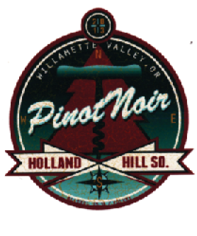
Gail created this label as a piece of original artwork to show off her 2013 Oregon Pinot Noir. “This was inspired by the love of nature and green living (and good wine) sustained by our neighbors on the left coast. The circular design pays homage to the scout patches and emblems work by park rangers, and the tree is representative of the abundant timber in the state of Oregon. The corkscrew is the ‘T’runk that points south to the compass rose symbol for our winery.”
BRONZE
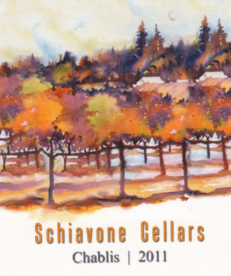
To dress up his 2011 Chablis, John borrowed some original artwork from a Sonoma County artist, Pia McKenna. Her painting, Sonoma County Vineyard III was painted on location in Sebastopol, California during the autumn. (Learn more about the artist by visiting http://www.nationalartsprogram.org/users/piamckenna.) This painting reminded John of a crisp and cool day, similar characteristics to Chablis wines.Every one of John’s labels has an inconspicuous crescent moon somewhere on the label. He says, “Rather than showing our family crest, I took one element from it, the crescent moon, and use it to symbolize our family heritage.” (If you look closely you can see it in the upper right hand side of the label).
READER’S CHOICE

“The Dark Tower is an eight-book series of epic proportions by Steven King, featuring a gunslinger on a quest toward a dark tower. I love the series and think the title is fitting for a big, dark Bordeaux-style blend. The Cab is vintage 2012 and the Merlot is 2013 — a fitting duality for the tower’s physical and metaphorical nature. My friend Drew Roberts created the art for this label in a style he calls ‘Silhouette Poster Style.’”
HONORABLE MENTION
