Design a Great Home Wine Label
Part of the joy surrounding home winemaking is being able to show off and share your creation with your friends and family. You are already proud of the wine you made, but when it comes time to share or gift your wine, you’ve got to be proud of the packaging too. You don’t want to present your wine in a naked bottle, or even worse a bottle decorated with a half-peeled commercial label. A lack of effort in packaging leads one to question the contents. Spend a little time and make your own wine label. In addition to making your bottles look smooth, you can then enter those labels into contests (ahem, like WineMaker’s annual label contest) and win great prizes! For advice on how to design a great wine bottle label, we asked the experts.
Lindsay Blasquez, CRUSHTag Head Designer
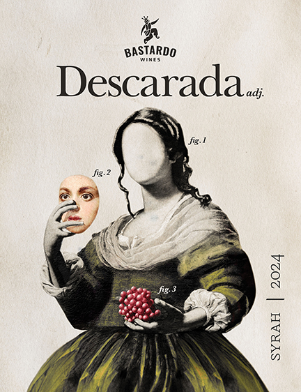
One thing that makes a good label is humor. You don’t have to be an expert in design to create a memorable label if there is a quality pun or joke involved. I always remember the labels that make me laugh.
Something else that I think sets certain labels above the rest is good typography. The best wine pun in the world can unfortunately be ruined if written in a font like Bleeding Cowboy. Try to stick to one or two fonts and keep in mind what info is most important hierarchically when deciding font size and weight.
Danielle Olesen, StickerYou Brand Manager
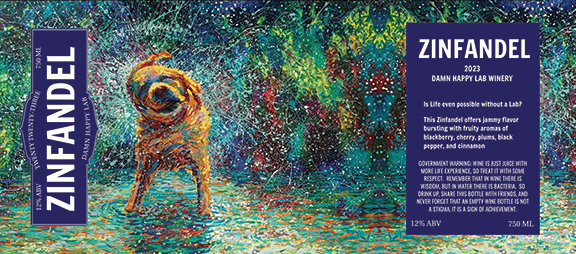
Here are some of my top tips on how to design for print. Labels often look great on the computer, but the results are less than stellar when printed.

1. Avoid using either very thick or very small light colored text on dark background (ex: yellow fonts on dark blue label). While it may look great zoomed in on your screen, at small sizes or with thin typefaces the text will become much less legible once printed.
2. Choose complementary fonts and don’t go overboard with text. It can be fun to mix a lot of different fonts, but rarely does it turn out looking as cool as you originally think.
3. Know your material! It helps to have a basic understanding of what material your label will be printed on. Designing for a clear label is different than designing for a white vinyl label.
4. Design for bleed! When creating labels, make sure your background color or border color goes over the cut line. This accounts for small errors or shifts in the printing or cutting of your labels.
5. If using images or graphics from the Internet, make sure they are high resolution. A low-resolution image will print blurry or pixelated, which can take away from the design or quality.

David Noone, Noontime Labels Owner
1. Having a theme and sticking with it is critical to creating a good label design. Color, images, text, and final composition should all be put together in a cohesive way to tell a story and create the intended “attitude.” If the theme were light and whimsical, then bright and happy colors with a casual font would make sense.
2. An easy way to get your text to “pop” is adding a shadow, outline, or glow, which can help isolate the text from the background.
3. Use of color can be a very powerful tool. Different colors make us think and feel different things — blue can be cold or serene, green is fresh and alive, black can be elegant or serious. Use color to communicate what the character of the wine is or the mood of the label.
4. Don’t forget to think about how the label will look against the background of the bottle, which will frame the label with its own color.