Visualize Sensory Evaluation: Utilizing spider charts to compare wines
I first ran across spider charts — also called radar charts — back around the turn of the century. I was general manager of Vinquiry, a wine-testing laboratory in Windsor, California. Along with testing wines for commercial wineries and the occasional hobbyist, we sold a wide range of winemaking products to those same customers. The producers were constantly coming out with new strains of yeast, new tannin additions, new malolactic bacteria, and so on. Their representatives would come to our laboratory to convince us to add the new products to our catalog. The more items we carried the more we might sell, but our inventory costs went up as well.
The producers used a variety of techniques to educate and persuade our buyers and senior staff about new products. They would sometimes bring wines that had been made from exactly the same grapes in exactly the same manner, with the exception of just the one new product. We could taste and evaluate the sample wine, but it is sometimes difficult to decide: a) Is there a difference b) if so, in what way? To help us make decisions, they would present a range of data and findings. There were tables, bar graphs, pie charts, and pages of information. Among the best visualization tools, though, were the spider charts. On this kind of chart, you can display several different samples and several different variables while providing a quick comparison that is easy to comprehend.
Spider charts do this by displaying the different variables (the number is up to you) along axes that radiate outward from a single center point. For any one sample or wine treatment, the data points on each axis are connected, running around the chart, giving the characteristic “spider web” appearance that gives these charts one of their names. For comparisons, you can overlay several different samples on the same chart using the same value scales. Sometimes the results show big differences and sometimes they are very similar, but in every case it is easier to visualize than just the raw data.
This display technique was especially helpful for one large project at Vinquiry. One of California’s many wine regions had a grower/vintner association that wanted to improve their standing (and potential pricing) in the wine marketplace. Since Napa County and Sonoma County produce, on average, among the most highly regarded California wines, they decided to use those for comparison. The association contracted with our senior sensory scientist to judge and score three different representative wines of five different varietals from each of the regions. She was then to write and present a report depicting how and to what extent the region’s wines differed from Napa and Sonoma. I had the good fortune to be selected as one of the judges for the wines. In an odor-free room, I swirled, sniffed, and tasted my way through the fifteen wines from each of three regions over several sessions. Each of us on the panel of judges tasted alone and assigned scores of one to five for each attribute of each wine. From that large body of data, the sensory scientist produced data tables, a text report, an oral presentation, and — spider charts. Those charts were the quickest and most accessible way to see that while Napa and Sonoma had fairly close overlays in most respects, the client region showed a tendency toward lower ripeness, muted aromas, and less intense varietal character. The numerical or raw data was all there in the report, and the charts made a big impact on the association’s growers.

To get a good picture of the comparison, choose variables that are meaningful to your outcome without becoming too complex to handle.
Next time you want to compare some wines in your hobby, consider this tool. For example, if you grow several varieties of grapes in your backyard and want to expand your vineyard, you might want to visualize which current variety makes the most pleasing wine. Or you may be unsure whether your yeast choice is really making a difference in your finished wine. Whatever it is you want to look at, get a few trustworthy tasters together, collect the data, and plot the results. To get a good picture of the comparison, choose variables that are meaningful to your outcome without becoming too complex to handle. For instance, plotting both “color” and “clarity” might contribute to more variables than you want to review, while combining those into “appearance” might simplify the analysis. Numerical values are essential; that is how the plot works. If you usually taste in qualitative terms like “intense” or “mild,” you will need to apply a scale of numbers instead. Plotting is most direct if you use the same scale for each variable. That is, rate one to five or zero to ten for each separate characteristic, not an assortment of different values for different variables. Also, make sure all tasters understand the terms of the different value assigned to these tasting standards and realize these charts don’t depict variation of scores among the different judges.
There are many ways to make spider or radar charts, including plotting the variables by hands-on free printable polar-graph paper like this example from California State University Northridge: https://www.csun.edu/science/ref/measurement/data/graphpaper/polar-degrees.pdf. There are also proprietary apps and programs for computers and scientific calculators that will do most of the work for you. I found it convenient to use the Microsoft Excel spreadsheet program, which includes a Radar Chart plotting option, on my Apple Macbook Air. Chart 1 below depicts a couple of hypothetical wines that I made up to show you how it works.
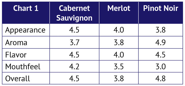
For this first example, I imagined I had made a Cabernet Sauvignon, a Merlot, and a Pinot Noir in the same vintage. When they were finished and ready to drink, I invited a couple of trusty tasters to join me in evaluating them for Appearance, Aroma, Flavor, Mouthfeel, and Overall Impression. I assigned a scale of one to five for each attribute, and took the mean of the taster’s results. Spider Chart 1 shows how the data came out.
I entered the data in exactly that format into an Excel spreadsheet (there is a very helpful YouTube tutorial by Computergaga under the title “Create a Radar Chart in Excel”). After that, it was simply a matter of selecting “other charts” and “radar chart” and this figure appeared instantly.

While the differences are not dramatic (I apparently make pretty good imaginary wine!), the chart shows immediately that my Cabernet Sauvignon is strong in Appearance, Mouthfeel and Overall Impression. Meanwhile, the Pinot Noir stands out in Aroma and Flavor, while the Merlot seems most balanced and well-rounded. Depending on your winemaking goals, these observations might help you decide what to make next. Some people would find it easy to draw such conclusions from the table of data alone, but the spider (or radar) chart provides a visualization that is easy to follow. As you use this tool (or other plotting software), you can develop it further by changing the scale of the axes, adding titles and labels, or other steps to enhance your data presentation.
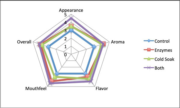
As a second example, I prepared a table to evaluate different treatments in producing one wine. I divided my theoretical must into four portions and added enzymes to one, did a cold soak on another, did both enzyme addition and cold soak on the third, and kept the fourth untreated as a control. Since my goal here was to compare the control to the treatments, I instructed my tasters to assign a value of three to the control for each variable. They were then to rate each treated fermentation on a scale of one to five, as compared with the control at a value of three. Chart 2 shows this hypothetical scenario.
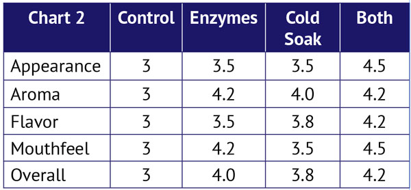
Once again, I entered the data in a spreadsheet and selected a Radar Chart.You can see that depiction in Spider Chart 2. Note here that the Control values, all set at three, provide a perfect pentagon. If the lines get pulled outwards in all directions, we can consider it an improved or better wine. With that in mind, the pull toward a better/improved Appearance, Overall Impression, and Mouthfeel is very clear for the “Both” option. (Bear in mind that I am just illustrating the tool; I made up this data and I am not attempting a rigorous statistical analysis). Once again, the data table alone contains all of the information, but the chart helps tell the story.
So how can you use this tool? Maybe you want to compare features like my examples: Multiple varietals or blends you have made or treatments like enzymes or cold soaking. Maybe you want to split a batch and try malolactic fermentation on one but not on the other. You can even compare post-fermentation treatments like back-sweetening. Adding sugar can affect not just the flavor, but also the aroma, mouthfeel, and appearance. So before you sweeten a wine, thief out a sample and sweeten at, say, three different levels plus an unsweetened control. Have your panel taste them, enter a data table, and make a radar chart.
To summarize, decide what wines or treatments you wish to compare. Select variables that are meaningful to your conclusions. Assign the range of values to be considered, select your tasting panel, and explain the protocol to them. Make score sheets, taste the wines, and collect the results. Calculate the average value for each attribute and enter the data in plotting software or plot by hand on polar graph paper. You will have a visual way to interpret your data.